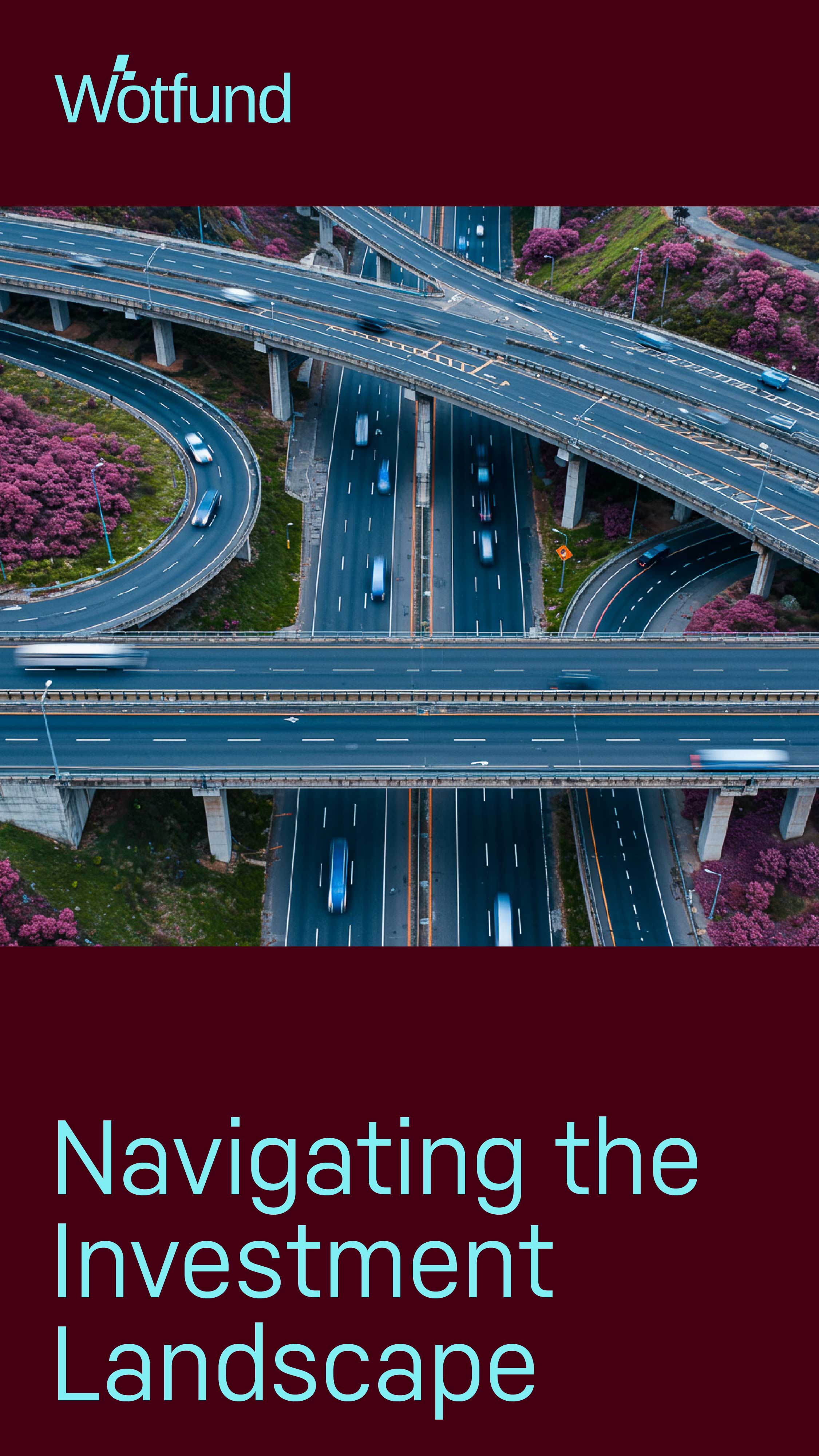
Let’s Fund the Future
Wotfund is a bold, future-facing investment platform designed to turn groundbreaking ideas into thriving ventures.
We developed a scalable, globally minded visual identity and digital ecosystem for Wotfund, one that resonates with visionary founders, purpose-driven investors, and changemakers across sectors.
With a sleek, dynamic design and a mission-driven voice, Wotfund positions itself as the platform where capital meets courage and innovation scales without borders.
SERVICE:
Research & Insights, Brand Positioning, Creative Strategy, Messaging & Voice, Visual Identity Systems, Motion Design, Art Direction, Photo & Film Ad
STRATEGY:
The core challenge was to define Wotfund as a credible, energetic, and visionary investment brand, one that speaks to founders and investors with equal clarity.
In a space crowded with traditional funds and static messaging, Wotfund needed to stand out as agile, smart, and truly global.
Key Strategic Approaches:
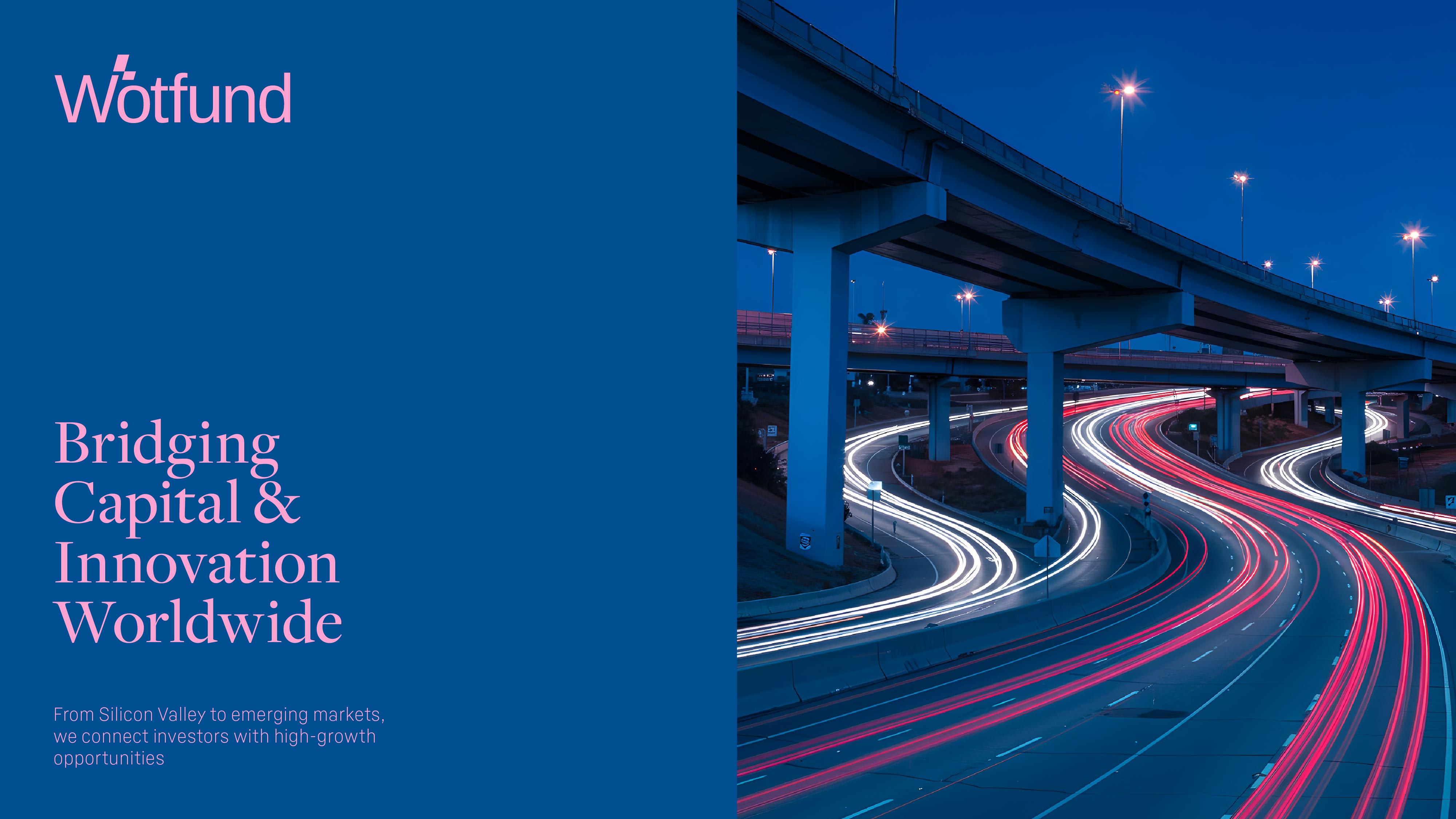
Vision-Driven Identity: Wotfund’s brand system was built to reflect bold thinking and unstoppable momentum. Its visual and verbal tone elevates ambition and dares users to act.
Disruptive Messaging for Disruptive Minds: The language is sharp, empowering, and future-focused. We crafted messages that speak to scale, vision, and impact, not just valuation.
Borderless Thinking, Accessible Tools: Wotfund’s platform is built for founders anywhere, with a structure and voice that feel just as relevant in Berlin as they do in Nairobi or New York.
DESIGN PROCESS:
Mantina’s visual identity blends Italian warmth with clean, sophisticated aesthetics. The core elements include:
Visual Identity:
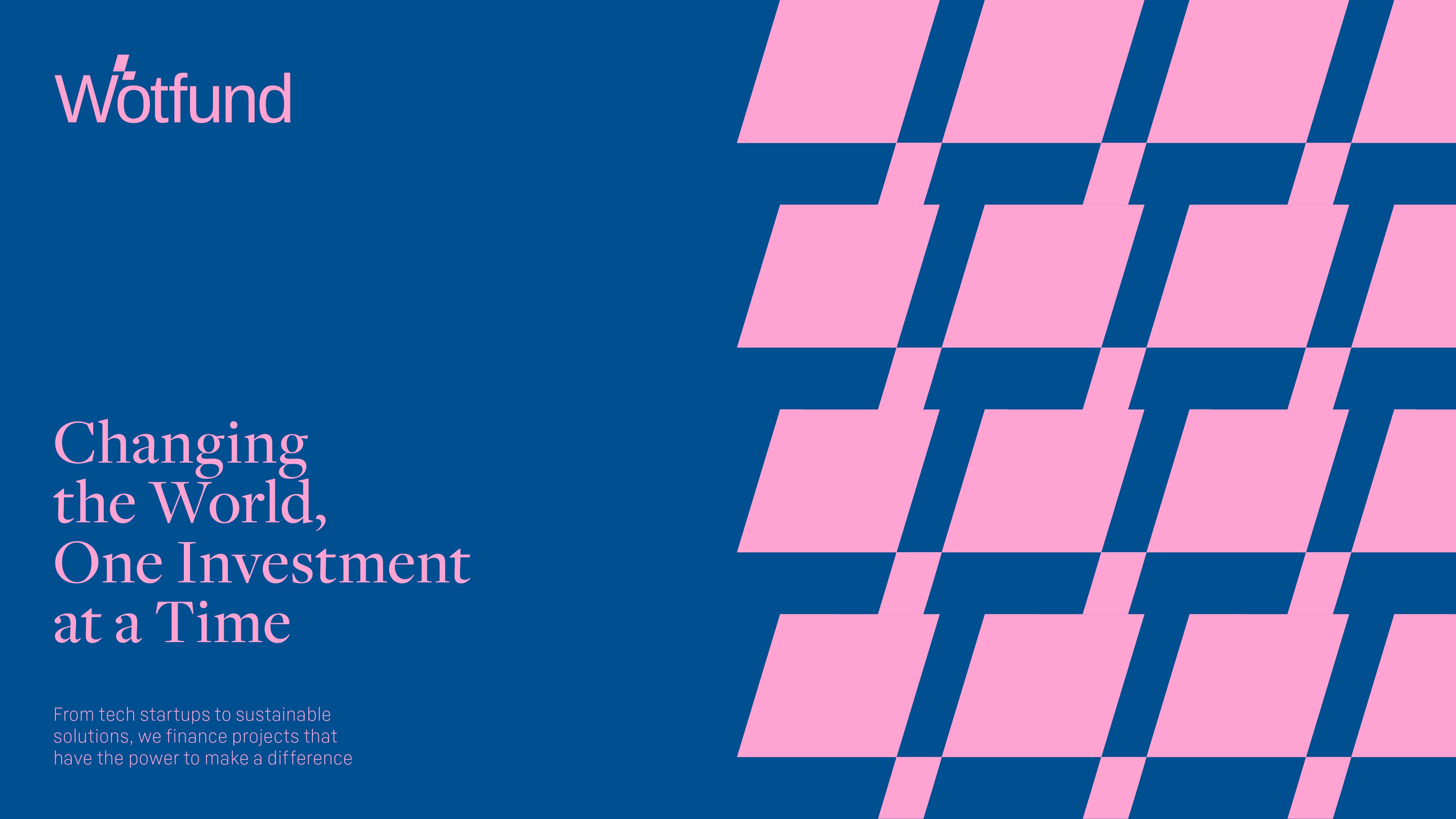
We created a high-contrast identity that blends clean geometry with expressive motion built for scalability, digital performance, and high-impact storytelling.
Logo Design:
The logo system features sharp modular elements, echoing growth, velocity, and trust. Its tech-inspired proportions hint at innovation, while bold execution brings gravitas.
Color Palette:
- Electric Blue: Represents energy, clarity, and momentum.
- Deep Charcoal: Confidence, structure, and trust.
- Soft White: Transparency and openness.
This palette balances bold ambition with timeless professionalism, perfect for a platform that bridges raw innovation and institutional capital.
Typography:
We used a modern, wide sans-serif for primary headlines and a neutral humanist typeface for supporting text. This combination ensures legibility while projecting confidence and clarity at every scale.
Motion Graphics:
Wotfund’s motion system is fast, assertive, and deliberate, reflecting startup speed and founder urgency.
Animated grid elements, modular transitions, and bold typographic entries guide the user through the digital experience, reinforcing clarity, purpose, and flow.
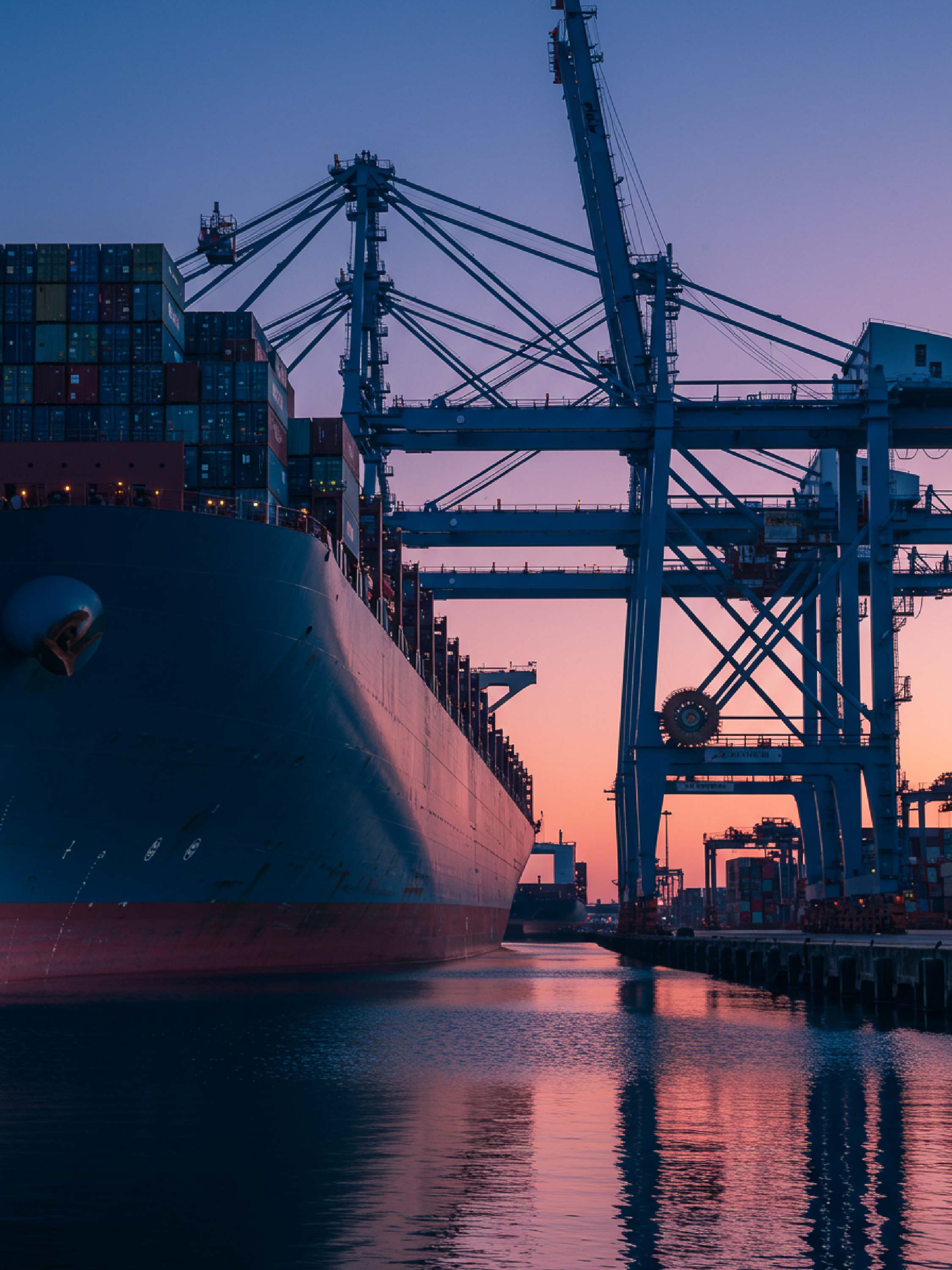
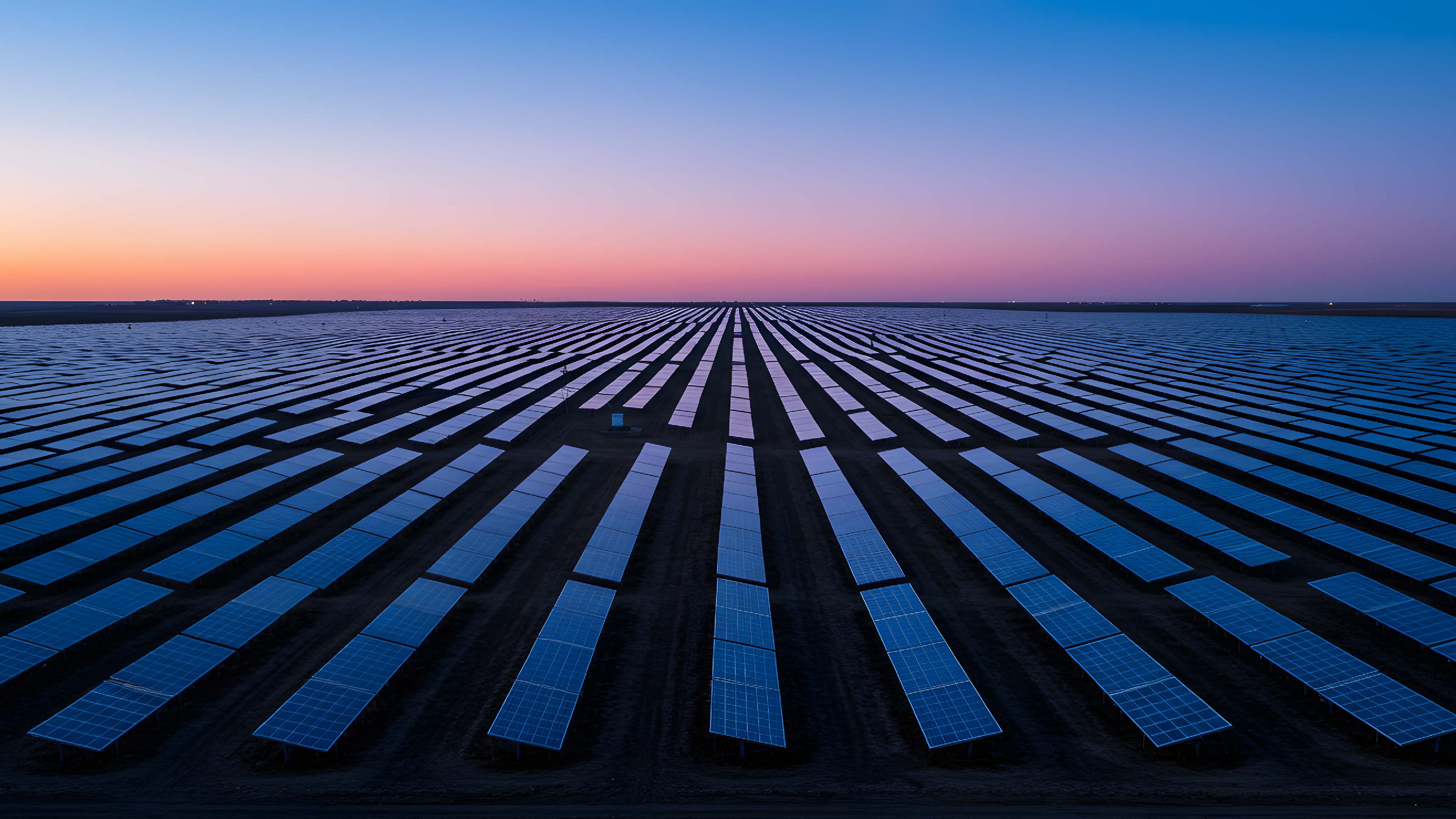
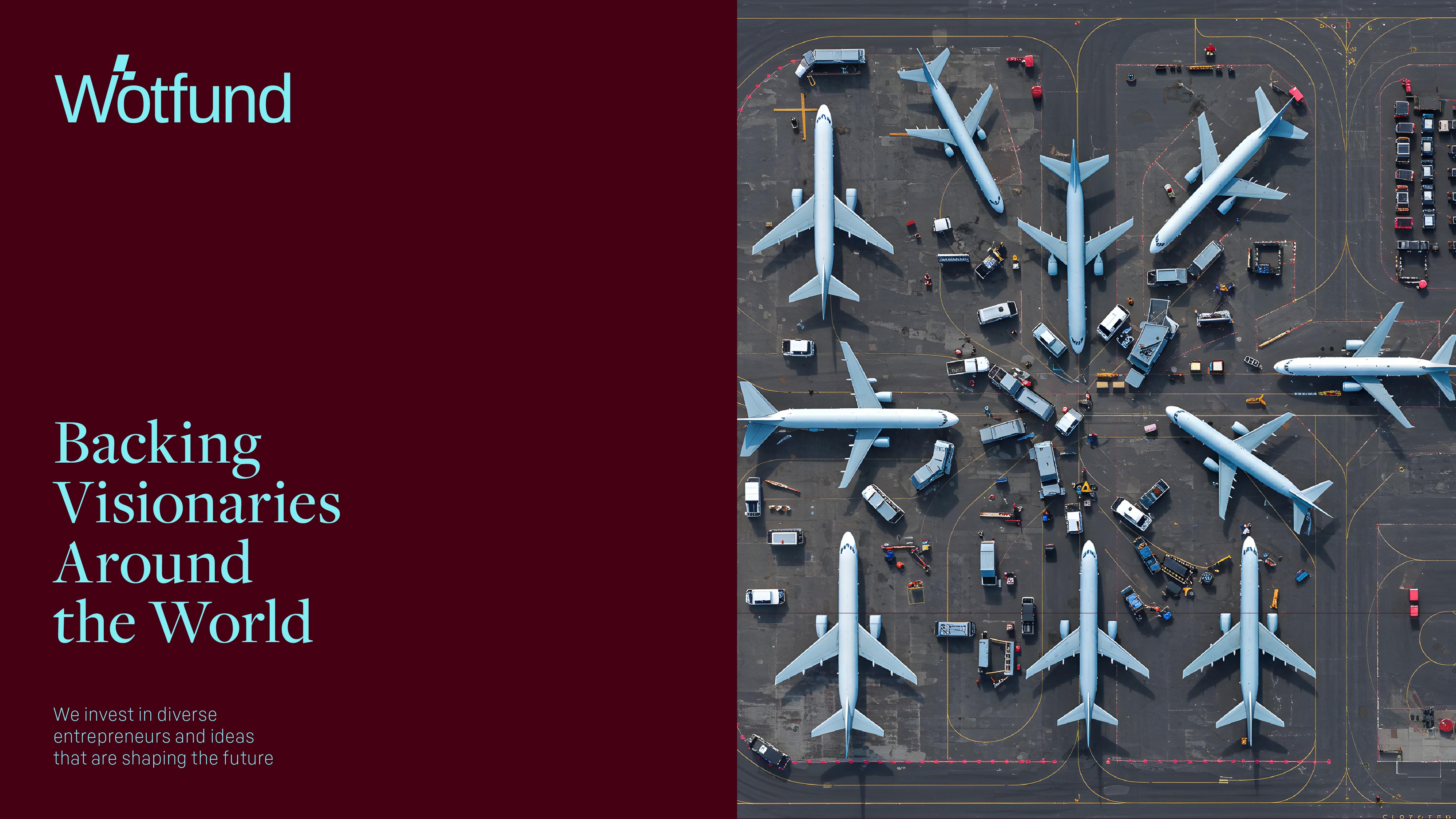
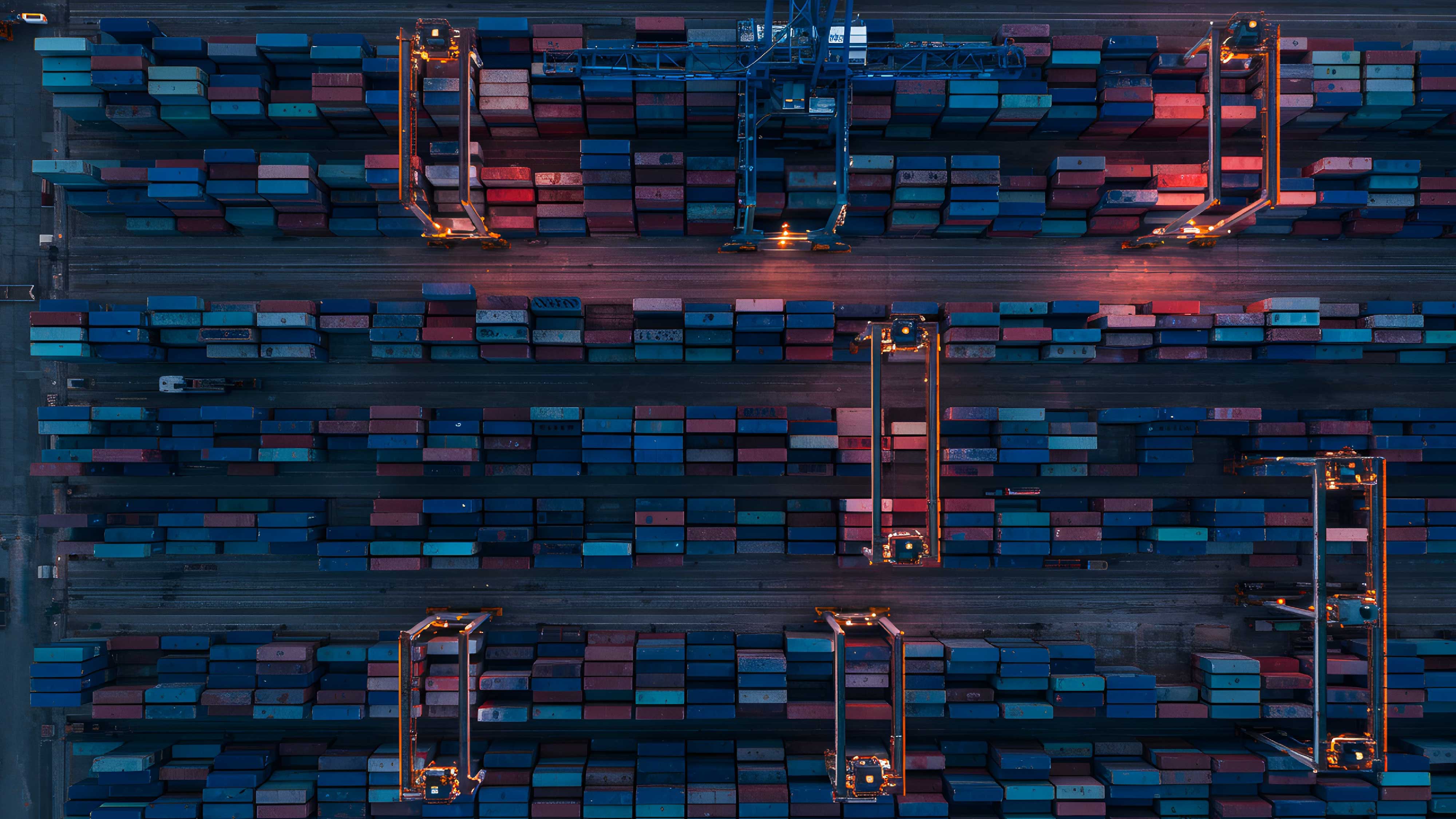
Photography and Visual Content:
Wotfund’s visual world is built on contrast, clarity, and momentum.
Photography captures the essence of bold entrepreneurship and visionary thinking. Each image is designed to evoke movement, potential, and the human drive to build.
Our visual storytelling balances intensity with clarity: Dark tones highlight resilience, bright accents signal innovation, and dynamic framing reinforces the sense of urgency that defines startup life. This isn’t just business photography. It’s a visual manifesto of possibility.


DESIGN IMPLEMENTATION:
We translated Wotfund’s identity across all brand touchpoints from digital to social to investor decks.
The result: a visually unified, strategically sharp system that communicates Wotfund’s mission without explanation.
Digital Concept:
The platform was built with a mobile-first mindset and global accessibility in mind. Interactive dashboards, pitch tools, and startup discovery flows were all designed to support rapid navigation and action, reinforcing the brand’s velocity and purpose
Campaign Messaging:
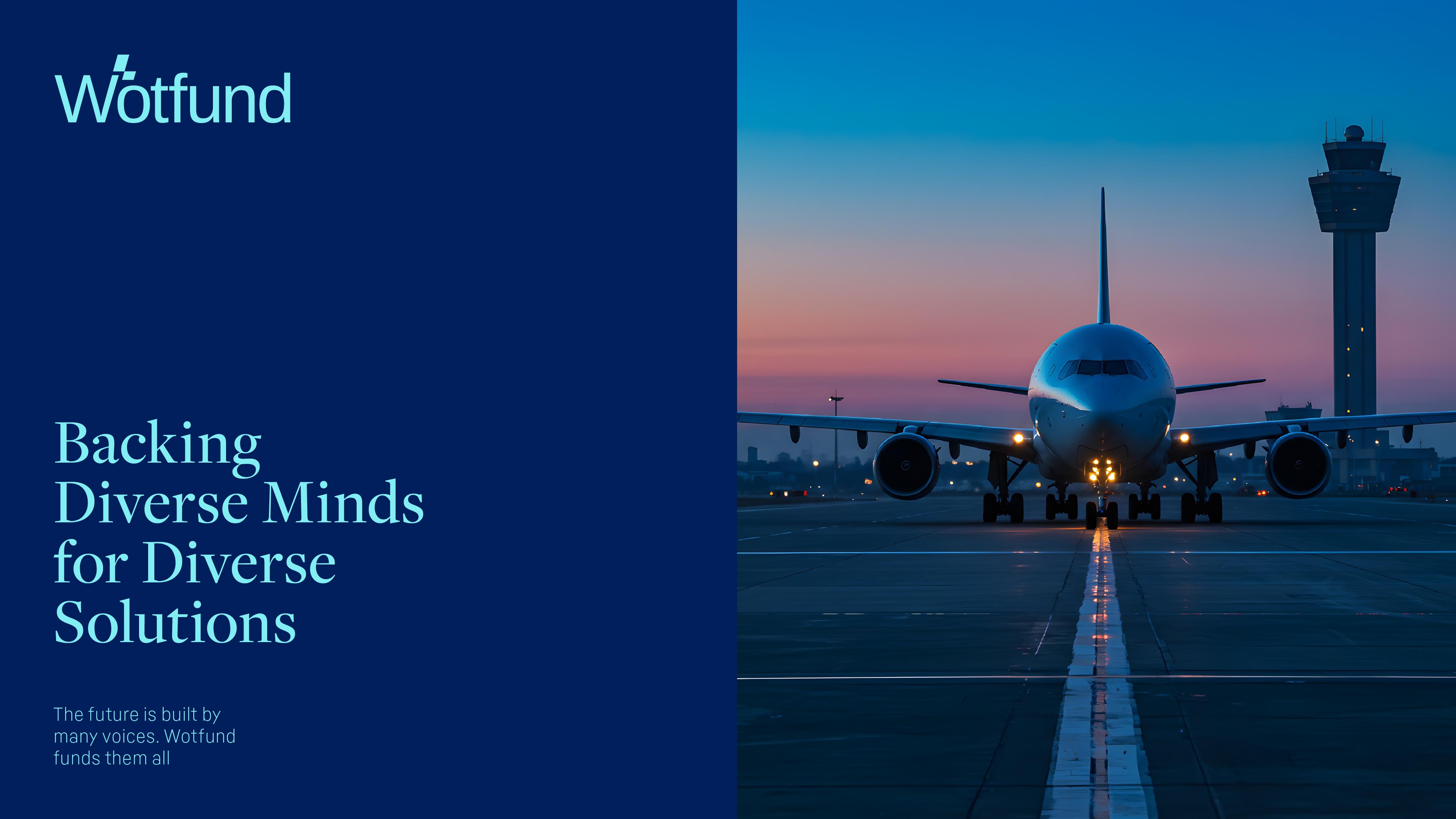
- Big Ideas Deserve Bold Investments – We don’t fund the obvious. We fund what’s next.
- Smart Capital for Fearless Founders – Backers that move as fast as you do. Strategy that scales with you.
- Investing Without Borders – We fund ideas in every language, from every corner, for every future.
Print & Event Graphics:
Investor kits, founder decks, and global event activations were all branded with high-contrast layouts and modular design systems. Every asset from large-scale posters to digital invites, reflects clarity, ambition, and trust.
TECHNICAL EXECUTION:
Advanced Design Tools:
- Adobe Illustrator: For crafting Mantina’s scalable logo and visual elements.
- After Effects: for high-energy animations and product demos
- Adobe Lightroom and Photoshop: For retouching photography to highlight the vibrancy and elegance of Mantina’s dishes.
Responsive Design:
All assets were optimized across breakpoints — from investor desktops to mobile-first founders, ensuring global usability.
Brand Guidelines:
A detailed brand system was created for Wotfund, outlining logo application, color usage, typography, and visual tone. This ensures consistency across all digital, print, and motion assets, reinforcing Wotfund’s bold, modern identity at every touchpoint.


RESULT:
Wotfund’s new brand identity positions it as a leader in purpose-driven, high-velocity investing. It doesn’t just look like the future, it funds it.
Outcomes:
- Increased startup applications by 3x within the first 90 days
- Global investor partnerships secured across 10+ countries
- Elevated investor trust and founder engagement through clarity-first design
Wotfund launchpad for visionary ideas shaped for tomorrow’s world. With every partnership, every bold move, and every breakthrough, Wotfund invites changemakers to redefine what’s possible and build the future, today.